Most brands ‘set and forget’ their email flows, bleeding revenue and wasting ad spend. My Email Flow CRO plugs those leaks, drives up revenue, and sharpens your brand. Want to see how much extra you could be adding to your bottom line? Get a free audit today.
Email #1 of the Welcome Flow is often the least optimized email in the whole of your automation framework.
Why? Several reasons:
It’s usually the first emaiil that any new brand makes. Meaning it’s the oldest in terms of brand guidelines and voice.
It makes a lot of money because it’s where your optin incentive is delivered. Hence, “If it ain’t broke, don’t fix it.”
For most brands, the Welcome Flow is a ‘set-it-and-forget-it’ asset. This article is going to give concrete proof for why that should never be the case.
Want the TL;DR? Skip to the Results.
Now, whose account are we working in, today? 👇
God's fingerprints started as a husband-and-wife passion project in 2015, inspired by their shared faith journey and love for art. Today, they create meaningful scripture-based art designed to bring God's Word into homes worldwide. Every piece combines artistic beauty with spiritual depth, offering a daily reminder of faith and purpose.
WELCOME FLOW EMAIL #1

IDENTIFYING THE NEEDLE MOVERS 🚀
Here’s what we felt could be improved in the original:
Monotone Layout: The design felt a bit flat, with sections blending into each other. Key info lacked clear start and end points, making it easy for recipients to miss the main message.
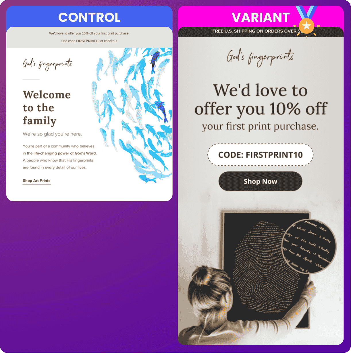
Weak Deliverable Above the Fold: The code was buried in a small section usually reserved for free shipping notices—not even in the top headline. The only CTA was a subtle underline, easy to overlook.
Shyness in Selling: The design had a "playing it safe" vibe, common in the early stages, especially in the faith-based space. It seemed hesitant to promote boldly.
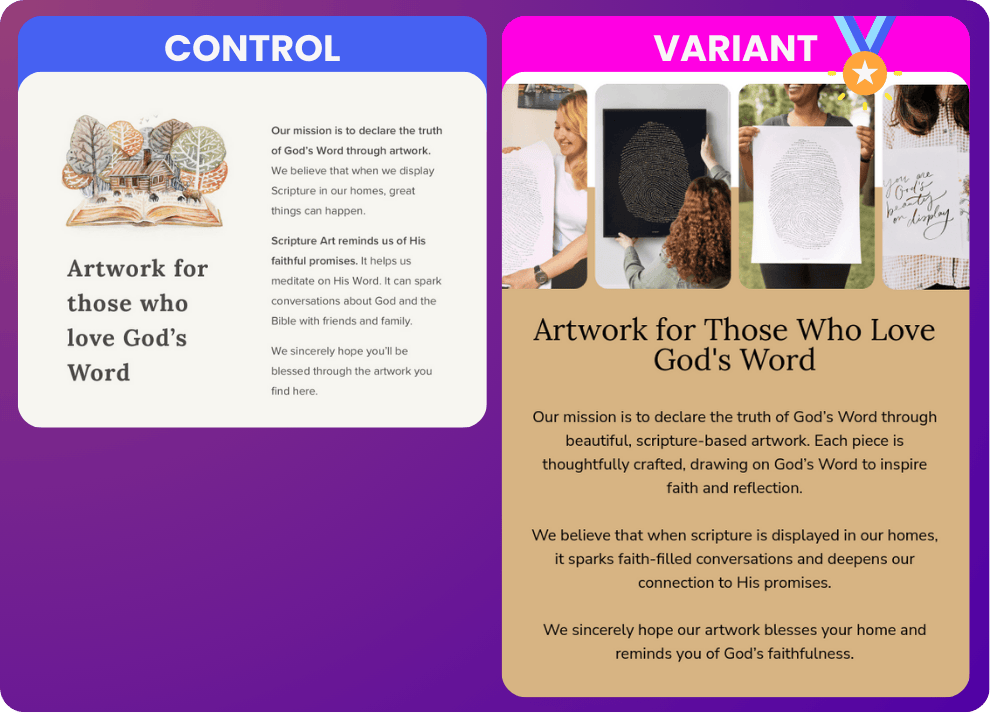
Mission Section with Low Contrast: The mission got lost with minimal contrast between sections. No clear break, so the core message didn’t stand out.
Art as Background, Not Product: Art was used like wallpaper—background images that didn’t clearly signal, “This is a product you can hang on your wall.”
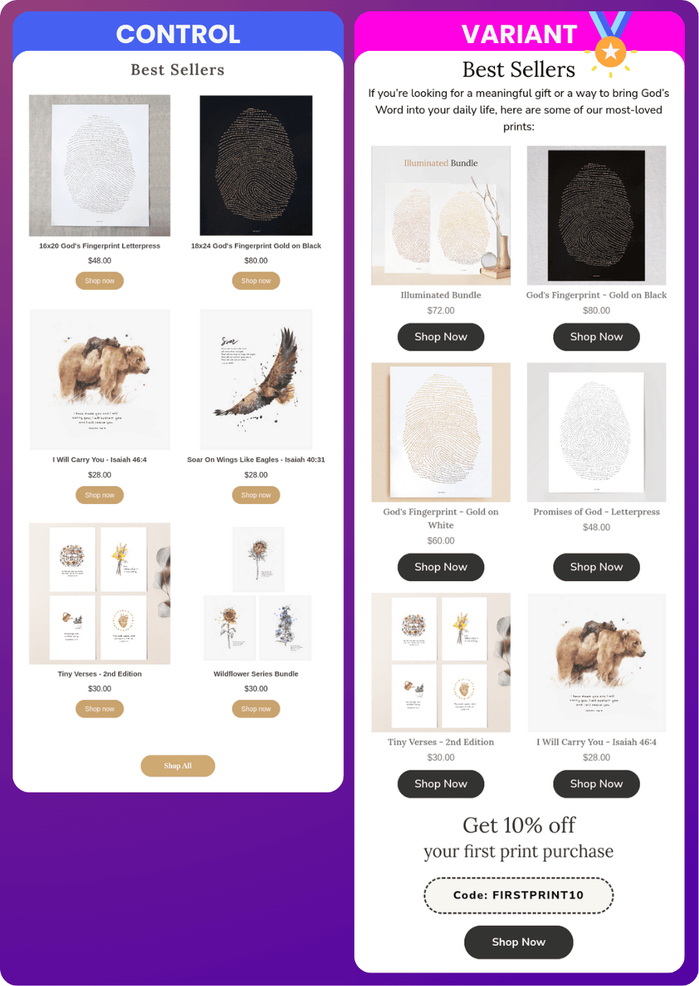
Bestsellers with Low-Impact CTAs: The bestsellers were there, but the CTAs didn’t pop as much as they could have. Good effort, but lacking punch.
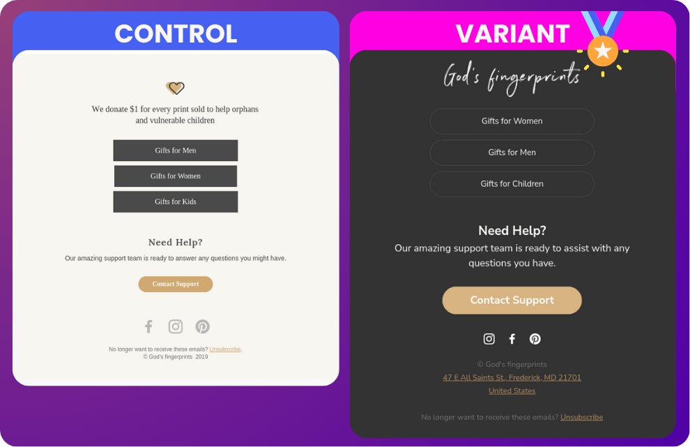
Footer CTA Overload: The most eye-catching buttons were for “Gifts for Men/Women/Kids,” but they were stashed down in the footer. Buttons were boxy, dark slate, and looked like an afterthought.
THE CHANGES WE MADE
Let’s start with the Hero section. It’s the heavy lifter of heavy lifters:
HERO SECTION
Spotlighting the Hero Product: In the control, the artwork was used as a background, losing its impact. We centered the flagship piece—the God’s Fingerprint artwork—in a high-contrast way, opting for the darker variant to make it pop.
Real-Life Context: Added a human touch by showing someone hanging the artwork without eye contact, making it feel like it’s being displayed in the recipient's own home.
High-Visibility Free Shipping Bar: Positioned a contrasting free shipping bar at the top for immediate visibility.
Clear Branding & Offer: Centered the God’s Fingerprint logo, followed by a bold headline: “We’d Love to Offer You 10% Off Your First Print Purchase.” Displayed the code FirstPrint10 prominently with a large, high-contrast “Shop Now” button.
Memorable Discount Code: The discount code was designed to be clear and easy to recall. Each CTA auto-applies the code, ensuring a seamless experience.
BODY COPY - “Welcome to the family.”
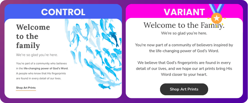
Authentic Brand Voice: Rewrote the welcome message to resonate authentically, creating a sense of community while respecting the brand’s voice.
Concise & Inviting: Kept the message brief and approachable, helping new subscribers feel part of something meaningful.
Distinct CTA: Added a high-contrast “Shop Art Prints” button, setting this section apart and making it easy for readers to take action.
MISSION SECTION
Visual Separation: Used a tan background with black text, creating a natural break without overpowering the mission’s message.
User-Generated Content (UGC): Featured images of real customers interacting with the artwork, focusing on the hero product to reinforce its importance.
No CTA for Subtlety: Allowed the mission to stand alone, prioritizing sincerity without a direct sales prompt.
BEST SELLERS SECTION
Curated Product Display: Created a static block showcasing bestsellers, allowing precise product selection to spark interest.
Enhanced CTA Visibility: Increased contrast on “Shop Now” buttons to improve clarity and encourage clicks.
Discount Reminder: Reinforced the 10% discount offer with another “Get 10% Off” reminder and a bold CTA, auto-applying the code at checkout.
GUARANTEE, MISSION & GIVE BACK SECTIONS
Universal Klaviyo Blocks: Built these sections as universal components to ensure consistent brand messaging across campaigns, with the flexibility to update in one place.
Authentic Charity Imagery: Showcased real photos from the supported charity in the Give Back section, appealing to the audience’s values and adding emotional resonance.
Polished, High-Value Look: Redesigned the footer to align with a luxury aesthetic, giving the brand a sophisticated finish.
On-Brand Cohesion: Reinforced the image of God’s Fingerprints as a premium brand, positioning it as art worth displaying in the home.
THE RESULTS
We tracked the numbers, and the results were clear as day: the redesign delivered.
Placed Orders: +176% increase in placed orders.
Revenue per Recipient: Boosted from $1.02 to $2.68 (+$163%)
Despite similar open and click rates, conversions skyrocketed. The new design did exactly what we wanted—it pushed more people to buy without losing the brand’s flavor.
WHY IT WORKS
(& HOW YOU CAN DO IT, TOO.)
This isn’t just about making things “look nice.” Design is about creating an experience that’s cohesive, compelling, and builds trust. When new subscribers open this email, they know exactly who God’s fingerprints is and why they should care. They’re confident and ready to buy.
Key Takeaways:
Make it visually inviting: This is an attention economy. If your design isn’t capturing attention you’re going to lose.. People also want something nice and interesting to look at.
Emphasize your brand’s mission: Tell them why you’re different. People want a reason to connect.
Simplify the CTA: Bold and clear. Don’t make them search for the next step. Make it more obvious than you probably wish to.
Give ‘em what they want: If you have an obvious hero product, show it, ideally in use, several times.
Keep the copy: Most of the time, you don’t need to upgrade the copy. Emails are like inbox landing pages. A lot has to do with the visuals. Try a visual upgrade first. Save the copy upgrade for a test down the road.
More detail on what we changed in the email with side-by-side comparisons start here, just in case you skipped down.
Looking for help? It’s me. I’m the help. ✋
I work in my client’s accounts personally.
I don’t farm out the work.
If I have people on my team, they’re excellent marketers and paid well.
If you want someone on your team, I’m your guy!

