Most brands ‘set and forget’ their email flows, bleeding revenue and wasting ad spend. My Email Flow CRO plugs those leaks, drives up revenue, and sharpens your brand. Want to see how much extra you could be adding to your bottom line? Get a free audit today.
As a merchant, it’s not often you get to take the time to look back on a series of tests that have been run in your email account and see how things have progressed, along with the proven increase in revenue.
…but that’s probably because you don’t have me piloting the account.
Today we’re diving into one of my favourite clients: Dr. Woof
Founded by Dr. Ron See, a veterinarian by education, who runs the business like his life depends on it. (And we just so happen to share the same birthday. 🎉) Today, we’re looking at the first email in Dr. Woof’s Browse Abandonment Flow.
TEST #1: DESIGN CHANGE
When taking over an account, I rarely like to change the copy first. Generally, I’ll upgrade the Look & Feel and use the same copy, at least to start.
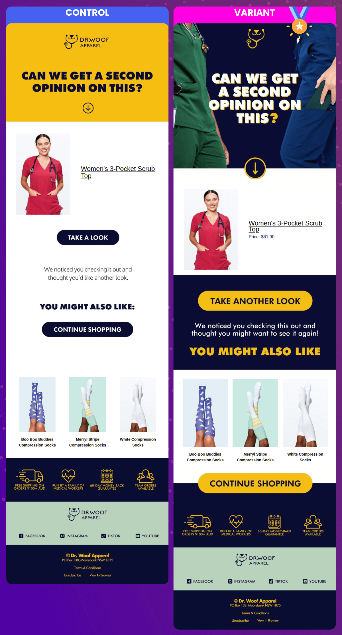
While I can look back and cringe at this design now, back then it was an improvement on the original. Same copy, but we threw in some very popular scrubs colours into the hero image. We also created distinction between the dynamic section that the user had viewed and the following sections.
Also, BIGGER BUTTONS.
TEST #1: THE RESULTS
Placed Order Rate 👆
AOV 👆
Revenue Per Recip 👆 (Which is really the golden metric for most automation testing.)
If you take into account the amount of recips during the test and extrapolate that out across 365 days you wind up with a trajectory difference that looks like this:
Blue = what the Control was going to bring in, cumulatively, month-over-month, and the pink is what the Variant stacked on top of that result. 💪
Caveat: These are extrapolations. Not 100% accurate, obviously. The recips during the testing time frame might be higher or lower than the median. This can impact the trajectory projections. (Or… “trajections”…)
Bottom line, use it as a guide and a bit of inspiration, but don’t buy your next Lambo based upon these projections. ✌
TEST #2: COPY & DESIGN CHANGE
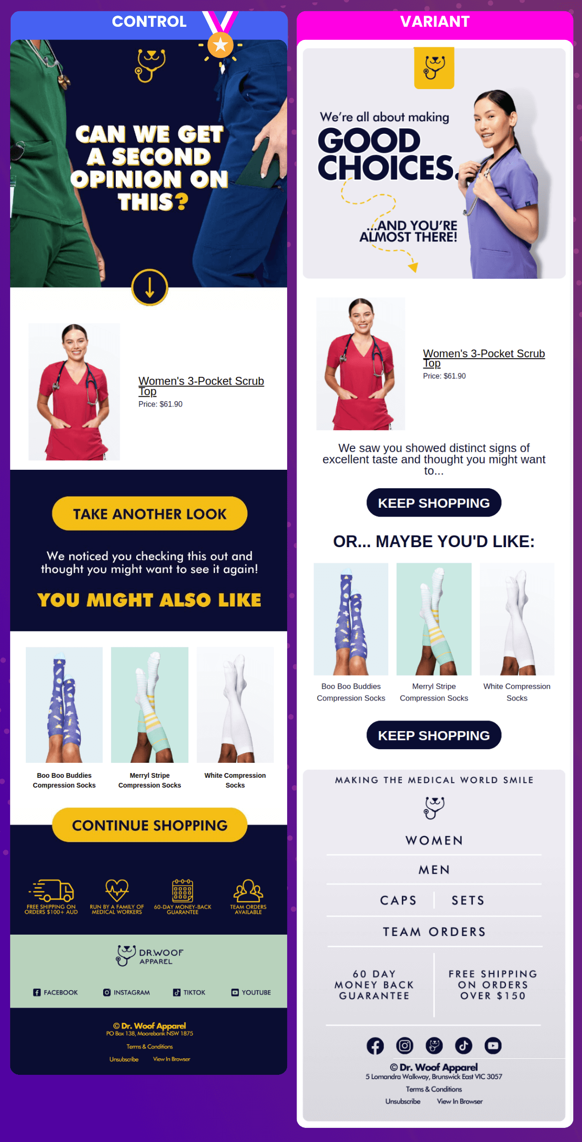
Okay! What’s the first thing you notice about this? CONTROL WINS.
Sometimes, we take an L and that’s cool. It’s about the process and trying to work out why something did or didn’t go our way. Here’s why I thought the Variant would win:
Slicker design. Hero was much more in alignment with the look and feel of winning campaigns we were sending out.
Eyes-forward model. Usually works to have the model looking straight down the barrel at the reader.
Here’s why I don’t believe it paid off:
I don’t think the copy change in the hero worked. On the Control we were asking the reader’s opinion. People love to be asked their opinions, even if it’s by an email.
(BTW, why do YOU think the Variant didn’t win? 😏 Seriously, though. I’m very much a student and would dig your feedback.)
Second reason on the copy: Kind of patronizing. You’ve almost made a good choice? Considering the audience is educated medical professionals, maybe not the best attitude to take with them.
Smaller buttons.
Could have been the footer, but I don’t think so. Additionally, we wanted to change the footer to be a bit more modern and this was a universal change across the account.
What do we do when we fail?
We observe the test, and as soon as it looks like it’s not going our way, we end it and try something else. The single biggest issue I see when auditing accounts is either:
No tests running
Tests that have been running for-🤬-ever. Whether winners or losers, you’re getting a fraction of the revenue you could be getting with tests that run too long.
TEST #3: REVERT COPY + CHANGE DESIGN
Winner, winner, chicken dinner. 🐔 VARIANT WINS! 🏆 Which is exactly what we want.
We’ve taken what was in the first test, and improved it. Then we took the improvement and improved upon that. Incremental improvements. 💪
At the end of the day I think the design was just better. We did have that model looking down the barrel and we once again asked the reader for their opinion. Button size reduced and button copy changed, but didn’t seem to matter. We got the W.
TEST #3: THE RESULTS
Placed Order Rate 👆
AOV 👆
Revenue Per Recip 👆
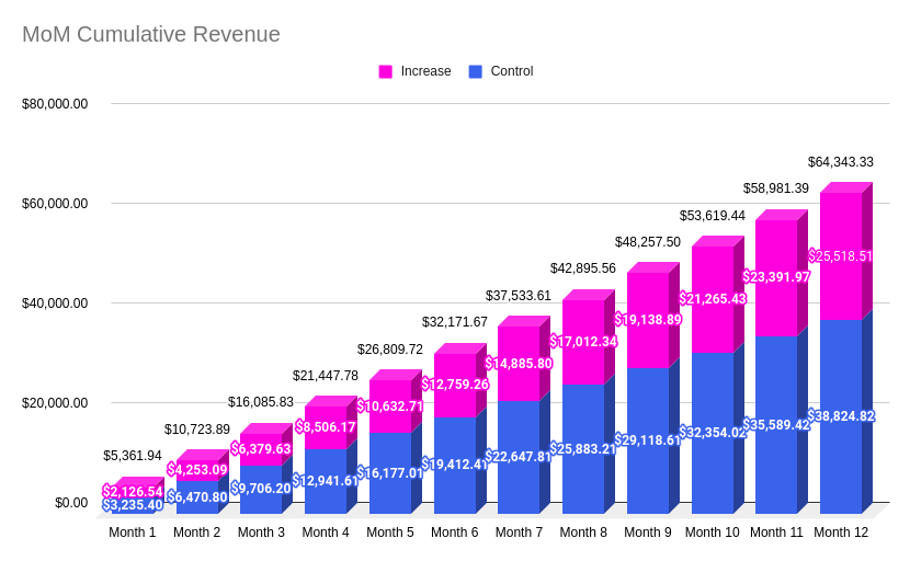
Over 365, we look like this:
The last successful test took the revenue trajectory total from this email over a year to about $52k. This test ended with a total of $64k. 🚀
What’s next? Another test, of course. Either on this email or another email in the flow. (But, rarely, if ever, two at the same time. That’s just bad practice because you create lots of variations of the customer journey. Just not ideal.)
Bottom line, when a test ends, you start another based upon your learnings.
CONCLUSION
Now, here’s the deal: The projections look sexy, but all we’re doing is taking a snapshot of the testing time period and saying:
…If the rest of the year looked exactly like the testing period, what would the performance of this email be?
Is it going to be the same? Nah. But…
Will it be similar? Probably, yes.
Have we run a test whereby the Variant beats the Control? Yes.
Have we moved forward with the winning Variant? Yes.
Have we done that on repeat? Yes.
Can we assume that with every winning test, we’ll improve performance of that email? Yes.
Will this improve overall account efficiency? Yes.
Will this improve advertising costs because we’re more efficient at extracting dollars from the leads the ad channels send into it? Yes.
Will our automated email UI/UX improve as a result of this testing? Yes.
Will that UI/UX alignment with our brand improve customer experience? Yes.
It’s just like site CRO. In fact, I call this process Email Flow CRO. If you’re willing to invest in site CRO, you should also be willing to invest in the automated email backbone of your business. Between your site and your email account, this is the very bottom of your funnel and most merchants never seriously look here.
Looking for help? It’s me. I’m the help. ✋
I work in my client’s accounts personally.
I don’t farm out the work.
If I have people on my team, they’re excellent marketers and paid well.
If you want someone on your team, I’ll be the Dwight to your Michael.


