Most brands ‘set and forget’ their email flows, bleeding revenue and wasting ad spend. My Email Flow CRO plugs those leaks, drives up revenue, and sharpens your brand. Want to see how much extra you could be adding to your bottom line? Get a free audit today.
Replenishment emails are can be goldmines for eCommerce brands. But too often, they’re set up with the bare minimum and left to run on autopilot. That’s exactly what we saw with our client’s Replenishment Flow, Email #1.
The result?
Low engagement
Poor conversions
Even worse revenue per recipient
We knew we could do better. So, we rolled up our sleeves, redesigned the flow, and the results were undeniable. Here’s what happened. 🚀
But first! Whose account are we working in?
Dr. Woof Apparel is revolutionizing medical workwear with scrubs that are functional, stylish, and built to last. Started by healthcare pros who were tired of boring, uncomfortable uniforms, they’ve created a brand that puts comfort and confidence first. If your scrubs aren’t Dr. Woof, are you even medical working, bro? 🩺🐾
Step 1: Identifying Opportunities in the Original Design

The control email had a few glaring issues that we spotted immediately:
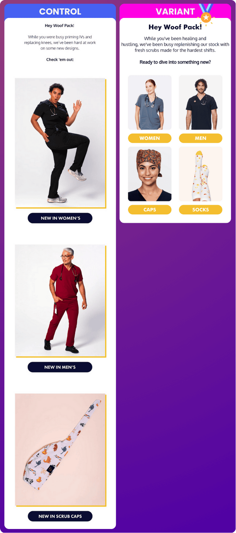
Weak Headline: “Did You See What We Just Added?” This headline was too vague. It didn’t generate any urgency or tell recipients why they should care.
Low Visual Impact: The design lacked hierarchy. Each section blurred into the next, and the product images didn’t stand out. There wasn’t a clear focal point guiding the recipient’s attention. Plus, can you say “dated”?
No Social Proof: There was zero use of customer reviews or testimonials. For a product that relies heavily on trust, this was a major missed opportunity.
Step 2: Design Upgrades We Made
We completely overhauled the design with a focus on clarity, urgency, and trust. Here’s what changed:
Attention-Grabbing Headline:
Control: “Did You See What We Just Added?”
Variant: “Time for a Scrub-scription Renewal!”
The new headline created a sense of urgency and tied perfectly into the idea of replenishment, immediately giving recipients a reason to act.
Improved Visual Hierarchy
We cleaned up the layout and made each section visually distinct.
Bold product categories with high-quality images were front and center, guiding the reader’s eye naturally.
We shortened this whole section to reduce the scroll and increase the clicks
Dynamic, Actionable CTAs:
Control: “Shop New Arrivals”
Variant: “See What’s Fresh”
Every CTA in the Variant was reworked to drive urgency and action. High-contrast buttons ensured they couldn’t be missed.
Social Proof Integration:
We added a 5-star testimonial from a real customer, reinforcing product quality and trust. This simple addition made a massive difference.
Step 3: Tracking and Measuring Results
The numbers don’t lie. Here’s how the redesigned Replenishment Flow Email performed:
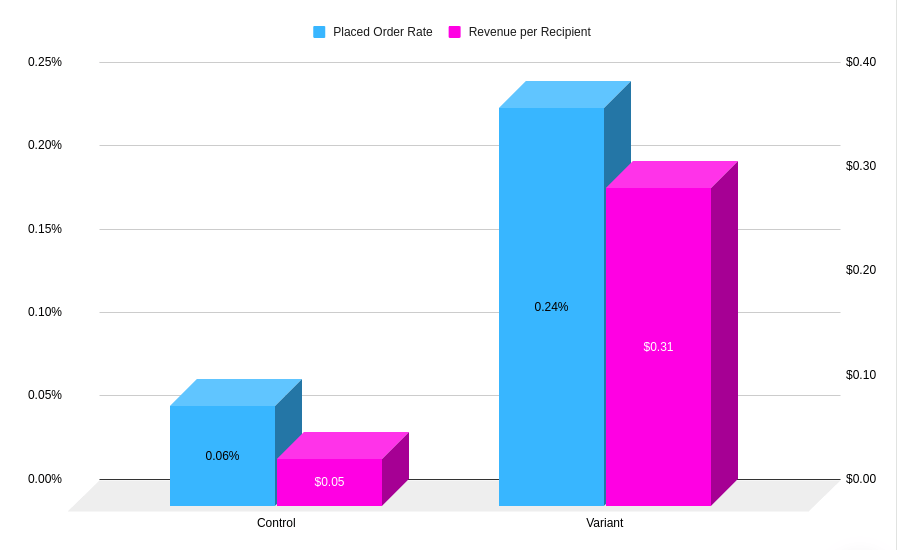
Revenue per Recipient: Jumped from $0.05 to $0.31—which is just massive when you consider this is for each and every recipient that comes through.
Placed Order Rate: Increased from 0.06% to 0.24%—a 300% boost.
Average Order Value (AOV): Control was $76, but the Variant crushed it with $128.
These results prove that even small design changes can drive massive improvements.
Step 4: Why This Works (and How You Can Do It Too)
Here’s why the redesign succeeded:
Urgency + Relevance = Action: The new headline spoke directly to the need for replenishment, played the pun game that Dr. Woof is known for, and created urgency, making the email feel essential.
Clear CTAs Win Every Time: Bold, high-contrast buttons with actionable language made it easy for recipients to take the next step.
Trust Drives Conversions: The addition of social proof (real customer testimonials) helped reinforce credibility and encouraged hesitant buyers to take action.
Key Takeaways
Here’s what you can learn from this redesign:
Hook them early: Make your headline relevant and urgent.
Focus their attention: Use strong visual hierarchy to guide the reader.
Don’t skip trust-building: Social proof like testimonials can make all the difference, even when speaking only to buyers.
Replenishment emails can be an absolute weapon for driving repeat sales—if they’re done right. Want results like this? Test your own flow, or let us handle it and unlock your email’s full potential. Reach out today, and we’ll make your emails work harder. 💪
Looking for help? It’s me. I’m the help. ✋
Your emails could absolutely be working harder.
You can forget about most agencies giving a damn about testing and proving their changes.
I neurotically work in your account personally and anyone on my team is directly answerable to me.
I’m here to have fun, make you money, and chew bubblegum. (And I’m fresh outta bubblegum.)
We’re a small team providing a boutique experience for mass production rates. If you’re looking for some support in your email account, apply to see if it’s a fit for us to work together.


