Most brands ‘set and forget’ their email flows, bleeding revenue and wasting ad spend. My Email Flow CRO plugs those leaks, drives up revenue, and sharpens your brand. Want to see how much extra you could be adding to your bottom line? Get a free audit today.
If you find optimizing the entire email too big of a job, you’ve got two options:
Work with me and I’ll do it for you. 🫡
Focus on the one part of the email that 100% of the people who open it see.
In this case study, I’ll show you how we took an underperforming Welcome Flow Email and turned it into a revenue-driving machine with just one targeted redesign. No need to overhaul the entire email—just focus on the part that matters most: above the fold.
Revel Nail: Started in Jersey with a big dream. 💅🚀 They’ve blown up from a small team with 25+ years in the beauty game to a global powerhouse, shipping to 50+ countries and winning awards left and right. They’re not just in the nail biz—they’re reinventing it, one dip at a time.
Step 1: Identifying Opportunity
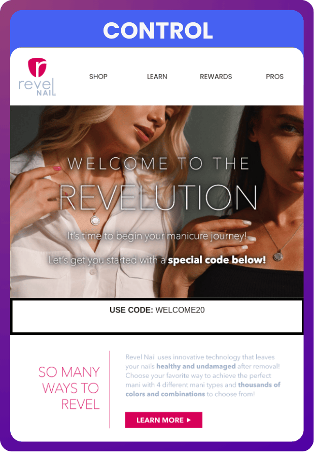
The original email (the "Control") had good intentions but struggled to deliver on execution. Here’s what stood out:
Poor Copy Execution: The copy on the hero had lift applied and was barely visible to the reader.
Weak Code Delivery: The discount code (WELCOME20) was boxed in black, easy to miss, and looked like an afterthought. It didn’t feel exciting or important.
Passive CTA: The only button above the fold was a Learn More link—not exactly action-oriented. No direct SHOP NOW button meant the recipient wasn’t nudged to take immediate action.
Lack of Social Proof: No mention of Revel Nail’s huge, loyal customer base. Why should new subscribers trust the brand?
Underwhelming Imagery: The hero section featured neutral tones and static visuals, which didn’t create excitement or a sense of urgency.
No real focus on the product. Though the girls in the hero had nails, it’s not like we were making any kind of a fuss. In fact, it looked more like an ad for the necklaces they were wearing.
The result? A single placed order. That’s right, one. The email was essentially dead on arrival. Now, do I normally allow an email to run for so short of a time that the Control is only able to achieve one order?
No. But when the Variant smashes the hell out of it in the same time period, it’s time to wrap it up and move onto a much harder challenge.
Step 2: Designing the Upgrade
We knew we didn’t need to redesign the entire email—just the hero. Here’s what we did:
Added Social Proof
We introduced a vibrant pink bar at the very top, boldly stating: “683,000+ Happy Customers 💗 Revel Nail.” This immediately establishes trust and credibility, leveraging the brand’s success to reassure recipients.Revamped Code Delivery
The discount code (WELCOME20) was reimagined as a coupon-style design with a dotted border, reminiscent of a cut-out newspaper deal that appealed to the target demo. It was centered, padded for visibility, and visually impossible to ignore.Focused on Action-Oriented CTAs
A bold, high contrast SHOP NOW button was added above the fold, grabbing attention immediately. The original Learn More button stayed—but this time as a secondary option, letting the stronger CTA shine.Enhanced Imagery
Gone were the static visuals. The new hero featured a bright, lifestyle-oriented image of two hands clinking glasses, nails on full display. It felt personal, celebratory, and aspirational—the kind of moment Revel Nail customers dream of creating themselves.
These small but impactful changes redefined the recipient’s first impression of the email, turning it into an engaging and visually compelling experience.
Step 3: Tracking the Results
The numbers don’t lie. Here’s how the variant performed compared to the control:
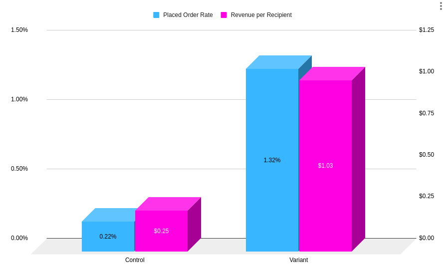
Placed Order Rate:
Control: 0.22%
Variant: 1.32%
That’s a 500% increase in placed order rate.
Revenue per Recipient:
Control: $0.24
Variant: $1.02
That’s a 325% lift, proving that better design can translate directly into better revenue.
Total Revenue:
This was a short test for sure, but even so the variant generated 4x the revenue for the same email list.
Step 4: The Big Lesson
This test proves that redesigning your entire email isn’t always necessary. By focusing on the hero section, you can leverage the 80-20 rule: small, targeted changes that deliver massive impact.
Here’s what made the difference:
Social Proof: Establishes trust and credibility.
Clear, Bold CTAs: Directs recipients to act immediately.
Engaging Visuals: Evoke emotion and make the email feel personal.
Improved Code Delivery: Ensures the discount is front and center, easy to remember and use.
Your hero section is the first thing recipients see—and often the only thing they engage with. If you get that part right, you’ve already won half the battle.
Looking for help? It’s me. I’m the help. ✋
Your emails? Yeah, they’re slacking off when they should be making you money.
Most agencies? They’ll slap some changes on your account, call it a day, and move on without a second thought. Not here.
I personally dive into your account like it owes me money, and my team? They answer to me directly—because I’m the kind of guy who loses sleep over subject lines.
I’m here to have a good time, make you more revenue, and chew bubblegum. (Spoiler: I don’t even like bubblegum.)
We’re a lean, mean boutique team delivering big-agency results without the fluff. Want help turning your emails into overachievers? Apply now, and let’s see if we’re a match.


