Bomber Eyewear was born in 1997 when World Champion Jet Ski racer Tommy “The Bomber” Bonacci got tired of ugly, uncomfortable safety glasses. So he built his own… lined them with jet ski foam, made them comfy, stylish, and, by accident, float. Twenty-plus years later, Bomber still makes shades that refuse to sink. 😎
We thought the warm, lifestyle-heavy welcome would convert better.
It had everything DTC marketers love: beach shots, smiles, aspirational lighting. It screamed brand story.
But deep down, we suspected the audience didn’t want to feel like a model. They wanted to feel like a man with a job, a truck, and sunglasses that don’t break.
So we built another version that said none of that out loud… it just looked like it.
What We Changed
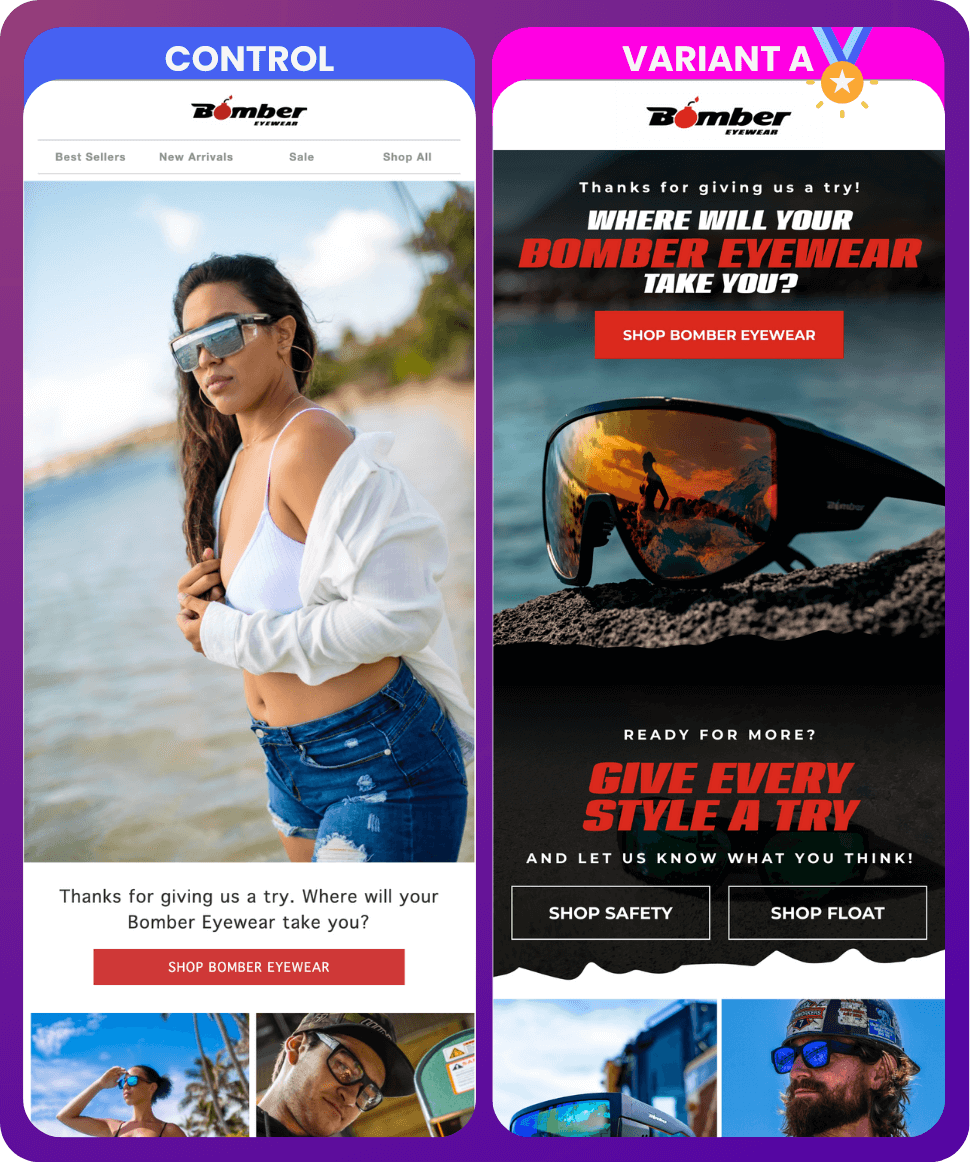
Control (Variant A): the soft one.
White backgrounds. Female model. Sunshine. Felt like a beachwear ad.
Variant B: the opposite.
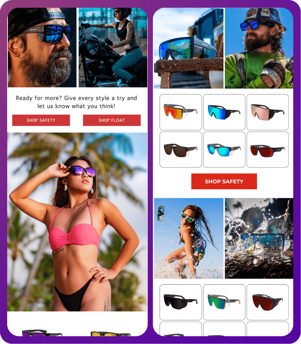
Dark background. High-contrast product shots. Strong type. “Shop Safety / Shop Float.” No cute fluff, no lifestyle filler. Straight to gear.
We weren’t testing a new subject line. We were testing brand identity: Does this audience want a vibe or a utility?

What Happened
What Happened
Numbers don’t lie:
Revenue per Recipient: $0.07 → $0.27 (+285%)
Order Rate: 0.15% → 0.35% (+133%)
Click Rate: 1.36% → 2.81% (+106%)
Variant B over tripled revenue. 3.86x the money from the same email, same list, same timeframe.
Why It Worked
The new version looked like Bomber’s real audience.
Industrial, adventurous, a bit rough around the edges. People who buy sunglasses for welding and jet-skiing, not brunch.
We dropped the “pretty” lifestyle framing and leaned into the product’s functionality as identity. The darker layout and bold typography screamed durability, not decoration.
People clicked because they could finally see themselves in the email… not some influencer on vacation. That’s what tripled revenue and doubled engagement.
Most brands over-romanticize the “aspirational customer.” Sometimes the aspiration is just gear that doesn’t suck.
Closing Insight
Everyone talks about tone, emotion, storytelling.
This test reminded us that sometimes, tone is design.
The difference between a brand that inspires and one that converts is how close you get to your buyer’s lived reality, not your art director’s moodboard. 🤫
The pretty email sold a dream.
The gritty one sold sunglasses.
And only one of those pays the bills.
Nothing’s Broken. That’s the Problem.
Your emails aren’t bad.
They send. They get opens. They make money.
Which is exactly why they haven’t been touched in months.
Cart abandon’s been “good enough” forever.
Winback does its thing.
Campaigns go out, hit average, move on.
No alarms. No urgency. Just quiet underperformance.
You already know there’s more there. You’ve seen it in other accounts. You’ve thought, “Yeah… we should test that.”
But when something’s working, touching it feels risky. Or, you know you just don’t have time to manage the testing. Maybe one test, sure. But relentless, methodical testing where you learn from the last test to ensure the next test beats it?
The biggest problem with accounts we audit is that there’s nothing that’s on fire. (Most of the time anyway. 😅) So you let them continue being average instead of putting them under your thumb and forcing them to sing for their supper.
Grab an audit. We’ll let you know what we’d do different.


